Some mobile rotation issue

Joined
Nov 24, 2022
Messages
80
Reaction score
7
Hello.
Can anyone tell me what is wrong with this code?
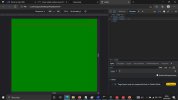
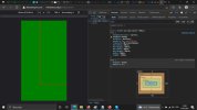
I want html element to fill whole area.

<html lang="Pl" >
<head><meta name="viewport" content="width=device-width, initial-scale=1/">
<meta charset="UTF8">
<style>
@media screen and (max-width: 900px){
html{background-color:green;display:fixed;position:absolute;border:2px solid red;transform:rotate(90deg);min-width:100vh;min-height:100vw;max-width:100vh;max-height:100vw;width:100vh;height:100vw;}
}
</style> </head>
<body >aa
</body>
</html>
 

Attachments

  • 111111.jpg
    111111.jpg
    80.2 KB · Views: 10
Joined
Mar 31, 2023
Messages
95
Reaction score
8
There are a couple of issues with your code:

  1. The display property should be set to block, not fixed.
  2. The position property should be set to fixed, not absolute.
  3. The transform property should be set to rotate(90deg) translateX(-100%), not just rotate(90deg).
  4. The min-width, min-height, max-width, and max-height properties should be swapped with each other. The min-width and max-height properties should be set to 100vh, and the min-height and max-width properties should be set to 100vw.
  5. You have a stray "aa" in the body of the HTML.
Here's the corrected code:
[CODE=html]<html lang="Pl"> <head> <meta name="viewport" content="width=device-width, initial-scale=1/"> <meta charset="UTF8"> <style> @media screen and (max-width: 900px) { html { background-color: green; display: block; position: fixed; border: 2px solid red; transform: rotate(90deg) translateX(-100%); min-width: 100vh; max-height: 100vw; max-width: 100vh; min-height: 100vw; } } </style> </head> <body> </body> </html> [/CODE]
 
Joined
Nov 24, 2022
Messages
80
Reaction score
7
Well...
For Redmi 9A needed to write this (so It look like YouTube in fullscreen)

if(screen.height==800 && screen.width==360){document.documentElement.setAttribute('style','background-color:black;display:fixed;position:absolute;border:5px solid black;transform:rotate(90deg);min-width:92vh;min-height:98vw;width:92vh;height:98vw;max-width:92vh;max-height:98vw;object-fit:cover;object-position:top top;max-inline-size: 100%;block-size: auto;left:-44.5%;top:23.9%;');document.querySelectorAll('IFRAME')[0].setAttribute('style','position:absolute;display:fixed;top:9.3%;left:0%;width:98.2%;height:89%;max-height:89%;border:0px solid black;');

what interesting is --- "left:-44.5%;" Don't know why, but it works. For one device.
Don't remember if need top also move but I think I do(and also -44.5%).
Some global constant? :|


Attachments

  • 111111.jpg
    111111.jpg
    63.6 KB · Views: 9
Joined
Sep 4, 2022
Messages
128
Reaction score
16
Hello !

as 'rotation' of the screen is automatic on a device.
why do you use a rotation of 90 degrees ? it's already ready to rotate.

you just have to keep you 900 limit as value to switch between one display to another.
you'll get an easy code without the 'rotate' statement.
 
Joined
Nov 24, 2022
Messages
80
Reaction score
7
"
as 'rotation' of the screen is automatic on a device.
why do you use a rotation of 90 degrees ? it's already ready to rotate." - YouTybe fullscreen rotates automatically, my webpage needs to rotate function (I'm still thinking about this solution, but I uploaded some videos and they look, I guess better when they are rotated on mobile devices.

I'll try to explain it this way, when I rotate screen, it is moved beyond the visible area, need to add this left:-44%
 

Ask a Question

Want to reply to this thread or ask your own question?

You'll need to choose a username for the site, which only take a couple of moments. After that, you can post your question and our members will help you out.

Ask a Question

Members online

No members online now.

Forum statistics

Threads
473,769
Messages
2,569,580
Members
45,054
Latest member
TrimKetoBoost

Latest Threads

Top